Looking for best website designs to create your next awesome website? We have tried to compile best designed websites that may inspire your design.
It is always delightful to come across work in the digital scene, especially when much of the said work can be brilliant as setting the tone for our own work within this field. So what kinds of trends are being followed nowadays? That’s a tough question to nail down but it is far more important to ask just what is being done by the successful developers and designers out there and what can you do to grab your share in the market.
You also find our pick of best responsive design websites.
Web design matters more than ever for companies wanting to get their product or idea out into the crazy world of the internet. A website is one of the most powerful marketing tools available today for businesses. It doesn’t matter the size of your company because your site can rank higher on Google regardless of its size.
A website is a good way to give your business some credibility and to reach new potential customers at a lower cost. Before you make your own, it’s good to measure the quality of a site by some current industry standards.
A good website should have:
- Simple elements
- Quality typography
- Engaging color scheme
- Branding for your company
- Easy navigation
- Social media
- Apps for phones or other devices
Gugurel’s Profile Website

Gugurel’s work is one of mystic fascination, if one would pardon the use of that terminology in this context. As his page says, the work is creative and focuses on delivering quality user experience. The idea is fresh, there is literally nothing visible on the page save for few buttons so almost intuitively the user has less complications to deal with and has more time to navigate around the page. The technique? Gugurel has simply tapped into the human psychic and figured out that the visitors will spend longer on the page if they have to work less to navigate. That’s a lesson for all of in the design profession.
Grand Hotel Dicomo

I like to call this website as menus done correctly. You can see perfectly what the entire business and service is about, everything that they are offering is done brilliantly on the website. The central part is more display oriented rather than having text whereas the menu is simplistic but complete in all of the services and information about the business. Again from the outlook of design, this is one subtly done for business, it is definitely very alluring to the eye and yet fulfills all the business objectives wonderfully. Another tip for all you budding artists out there.
450 GSM

This one is a joy to behold for all the minimalism lovers out there. We all know how the minimalist design has picked up pace as a trend in the modern business construct but it is another story altogether to see a business execute it well and with a flourish. Observe the elements of the website, there aren’t many and yet the entire site carries a very clean look which instantly adds to the appeal of the site. Look at the business in question, the offer is of print and ones who want printing done want the output to be presentable. See the link? The website translates the purpose and the feature of the business.
Pervolo

This is content centered design done with excellence. Notably many sites that attempt this concept end up adding too many panels, too many menu elements and too much of side text. Notice the grey area beneath the page, that tells you of how optimized the size is and yet everything you need to know to get a flavor about what pervolo is. The one thing which gives the site edge is the mood it sets with its background. Again design, wise this is use of psychology in play to get the visitor to be attracted to the site.
Alectia

This is a mixture of flat design and minimalism done correctly. It’s a big enterprise adopting this design and it speaks quite a lot to be able to opt for this kind of a concept for your website. Partially this is because of the skill of the designer, notice how the core services are highlighted as bigger panels. Again from corporate purpose that is how the site needs to be exhibited. That it looks as professional and coherent with the business as possible.
Kreativa Studio

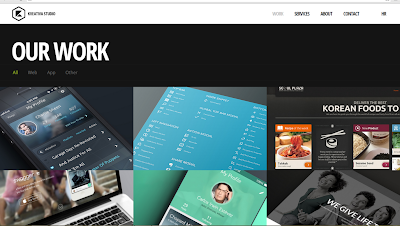
I like to call this a work on maximalism. Hear me out, even with the limited size of the picture you can easily understand what the entire site is about and you attribute creativity to this site. So when the user comes on to the site his first impression will probably be “wow, there’s a lot of choice here”. The trick is this diversity of options does not make him confused and instead excites him about discovering the website further. So if you add an extensive, content centered design into your website, ask the question: “would I be excited to discover the site further” and that will give you a good indication.
Velvet Hammer

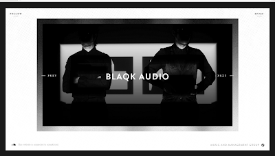
This is one site you all have to visit to get a true feel of. This is creativity done correctly and done in a very refined manner. It’s only fitting that a site of this caliber should belong to a music niche supporting independent artists. The truly mesmerizing element about the site is the scrolling animation which gives a very fluid impression to the website, almost as if you’re flicking the pages of a magazine, only simpler and more alluring. Top marks for originality on this one.
Seim MC

here is good reason as to why simplistic expression in design is so much in trend nowadays. Look at the page above for example, the appeal and mood is good but the page is exceedingly neat and yet still displays its features. This is a clever mix of content centrism and minimalism and this is especially achievable in certain conversion methods of creating websites such as PSD to HTML.
The company is a strategy consultant for businesses so it obviously needs to display its content amply, but their approach to fulfilling that is superb. So in retrospect they are catering to each business need and are actually helping them scroll through their services in a more efficient manner.
Thru You Too

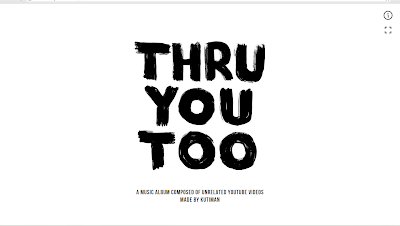
This is a concept in website making which is seldom executed successfully as a commercial front. This one is successful because of the minimalist approach it takes in each transition. So the elements of art and the animation are all standard but very natural in the manner they flow form one video to another in the playback.
So all in all the result comes out as an experience for the user as he scrolls through the website. This is promotional effort and it does pretty well in terms of putting itself out there.
Creative Live
Creative Live offers a catalog of hundreds of creative, online classes. Some are free and some are available for purchase at a reasonable price. Their site is inviting and easy to navigate through classes. I especially enjoy their typography which is readable and catches the eye.
Instructables
This site is good for the whole family! They have categories such as recipes, DIY projects, outdoor, design, and more with instructions that are easy to read and follow and you’re also available to download instructions into PDF form if you go pro. It’s a very simple site that is still presented efficiently.
Keep
Here’s a fashion and beauty site that is comparable to Pinterest. The pages are clean and neat. You’re able to hover the photo of the item you’re viewing and ‘like, keep, or buy,’ which makes it especially catered to online shoppers. Online shoppers want a site that provides a safe and quick transaction; this is the type of sight they looks for.
Elite Daily
If you want to read up on events in the news or something out of the ordinary, Elite Daily will surely have it. Their articles are witty and blunt. There are minimal ads, the typography is appealing, and you’ll always be surprised by what they come up with.
Their social media is on point with thousands of shares daily on Facebook.
Elle Decor
Not only a beautiful magazine, but Elle Decor has a beautiful website as well. Elle Decor’s website invites you in with class and style. The digital landscape is evolving and changing and Elle Decor is ahead of the game.
Whole Foods Market
I believe Whole Foods just redesigned their website and it looks awesome! It used to be hard to navigate but now it has specific pages for specific questions. It’s also colorful with bright/neutral colors and has an earthy feel to it, which never hurts!
Lush
This is one of my favorite sites, not only for the products they sell but for the way it’s designed. On that note, watch this awesome video from Lush Digital that shows how web design can and should make a massive statement.
Their new website design (powered by Drupal) increased website visits every month by 71% because of the progressive displays, interactivity and the look and feel of the site.
Vimeo
Unless you haven’t used a computer in the last five years, you’ve most likely heard of this one. Vimeo is a video sharing platform that was created in 2004 by a group of filmmakers. There are now over 14 million members and some say they prefer Vimeo instead of YouTube. The videos are works of art and people are able to express themselves. They offer a cleaner aesthetic compared to other sharing platforms and there are no ads!


0 comments:
Post a Comment